Tools: Flourish, Affinity Designer Client:Panorama Data: Monitorul Oficial, Ministry of Finance, Romanian Parliament, National Statistical Institute, National Bank of Romania Link: The Political History of Romania (RO) Color palette:
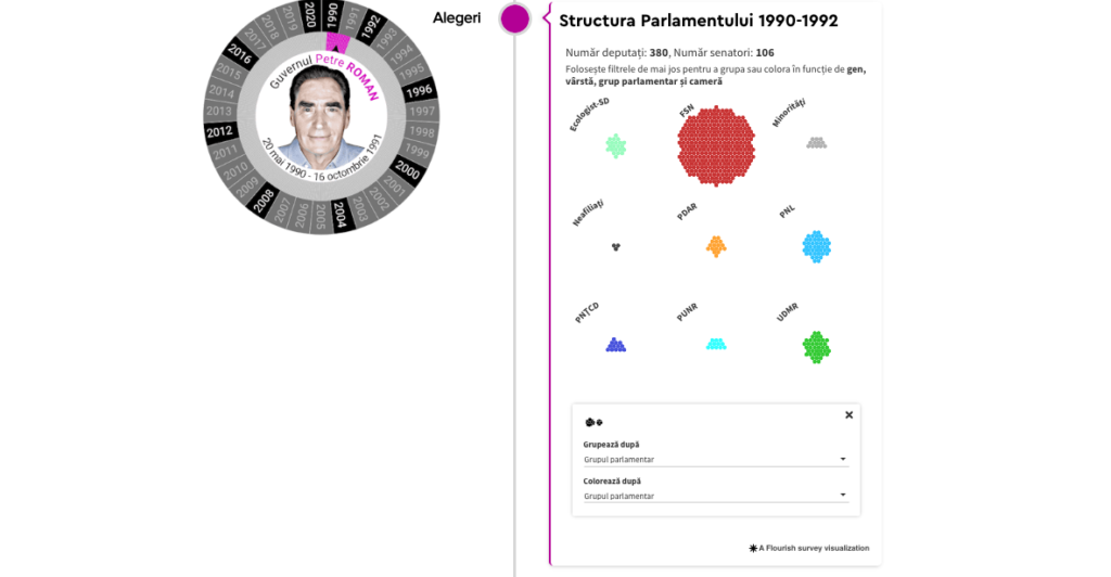
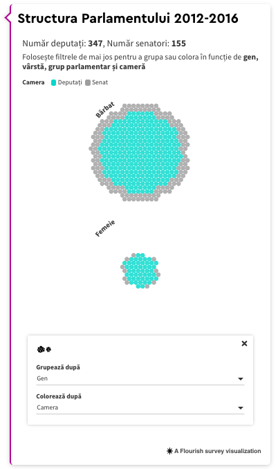
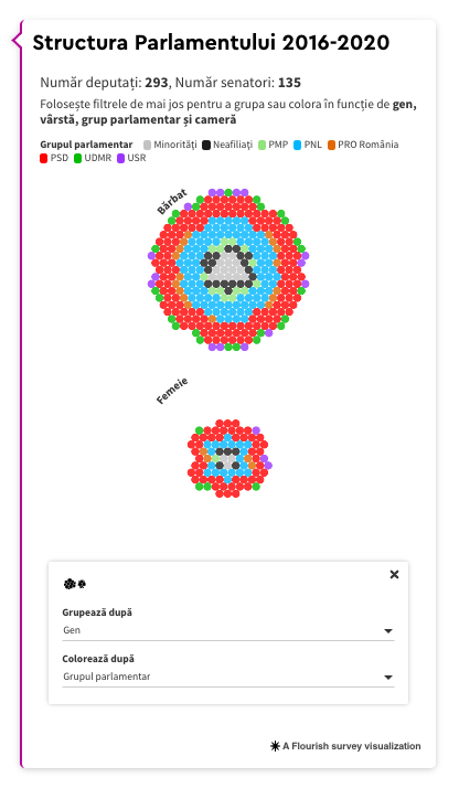
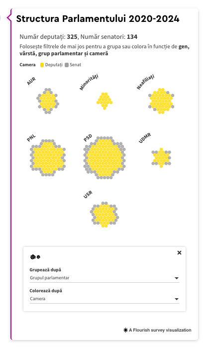
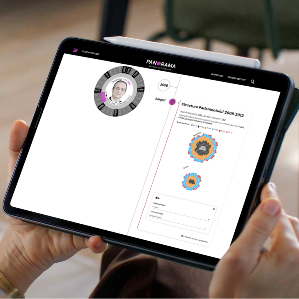
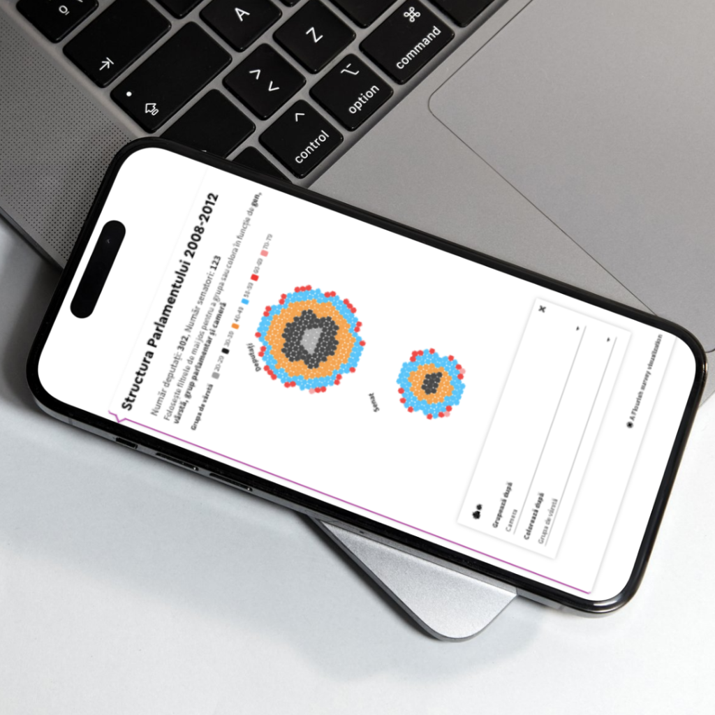
This project was one of the most exploratory I’ve ever worked on. I made it for everyday people, not political science experts, especially for those who feel out of touch with the systems that affect them. The interface is meant to spark curiosity, help people see how parliamentary representation works, follow the growth of major parties, and spot trends in political language over time.
Rather than making final judgments about politicians or where Romanian society is headed, this visualization was meant to show bigger patterns. It highlights how Parliament’s makeup has changed, how coalitions have shifted, and which themes keep coming up in government programs. The goal was to show how things took shape, not just the end results.
This project showed me that data visualization doesn’t have to be flashy to make an impact. Sometimes, its real strength is in quietly encouraging people to reflect and ask questions. Even if it doesn’t make headlines, a good visualization can help people think more deeply, and I see that as a real achievement.