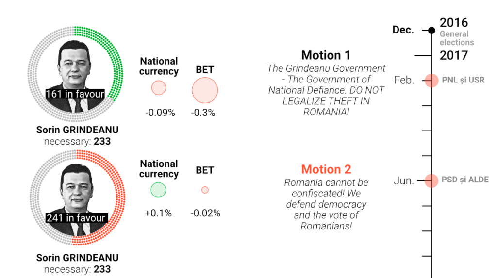
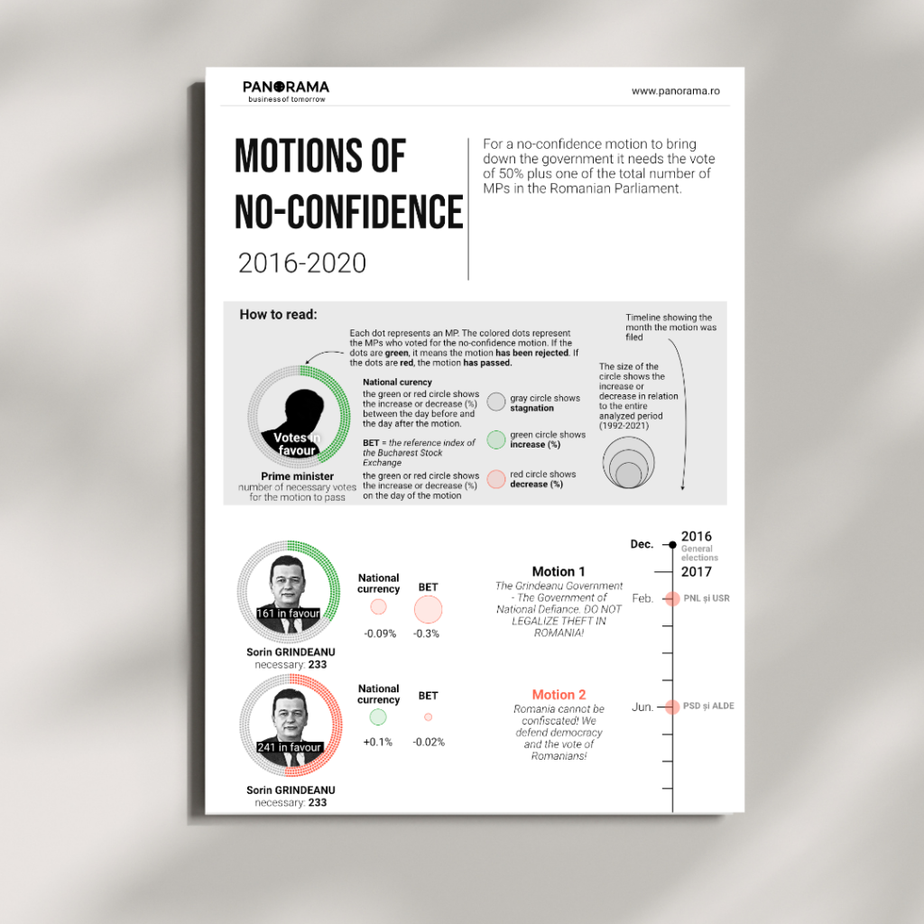
This project combines journalism and data visualization to explore how political instability affects Romania’s economy. In Romania, parliament can remove the government with a vote of no confidence, known as a censure motion. Over the past thirty years, this process has happened many times, providing a unique dataset to study how political uncertainty influences economic indicators.
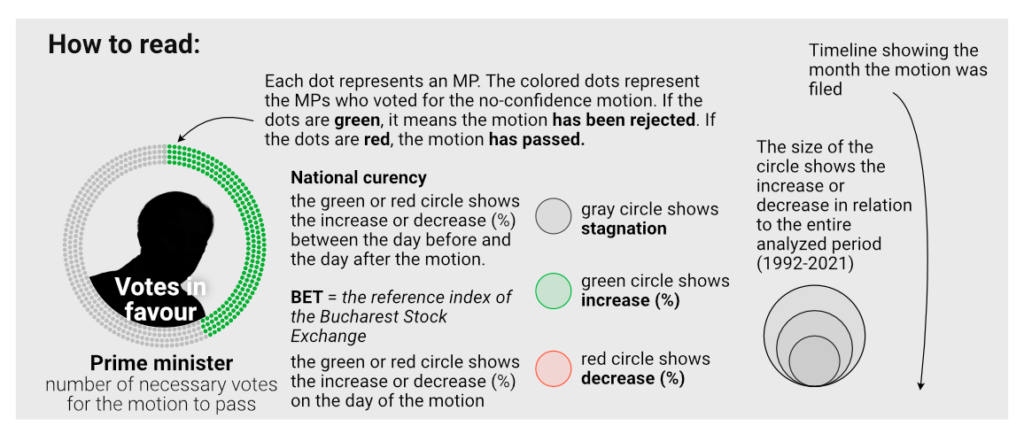
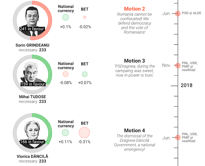
I designed a timeline that focuses on being clear and easy to understand. For each motion, I made a circular chart to show how many parliament members voted for it, along with indicators for changes in the currency or stock market. This simple method helps make the information easy to grasp, even for people who do not know much about Romanian politics or finance.
This project shows how simple visuals can help people understand complex topics. Although some say circular charts are hard to compare, the big differences in circle sizes here make the changes easy to see. Using red for decreases and green for increases also gives quick, clear signals that help readers understand the data right away.