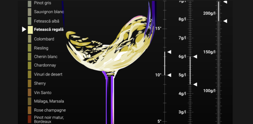
This visualization is one of my most lasting and frequently cited projects. I had to do a lot of research and gather data by hand since there was no single source with all the wine characteristics I needed.
This project highlights a common challenge in visualization work: real-world limits in editorial production. Even big publications often can’t hire many specialists due to budget constraints. I handled everything myself, from research and story development to data cleaning and designing the visualization, making sure to balance priorities and use resources wisely.
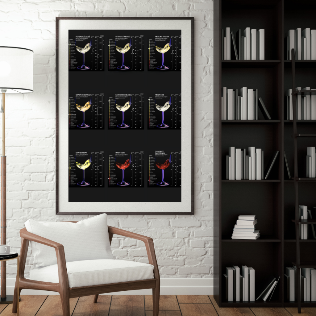
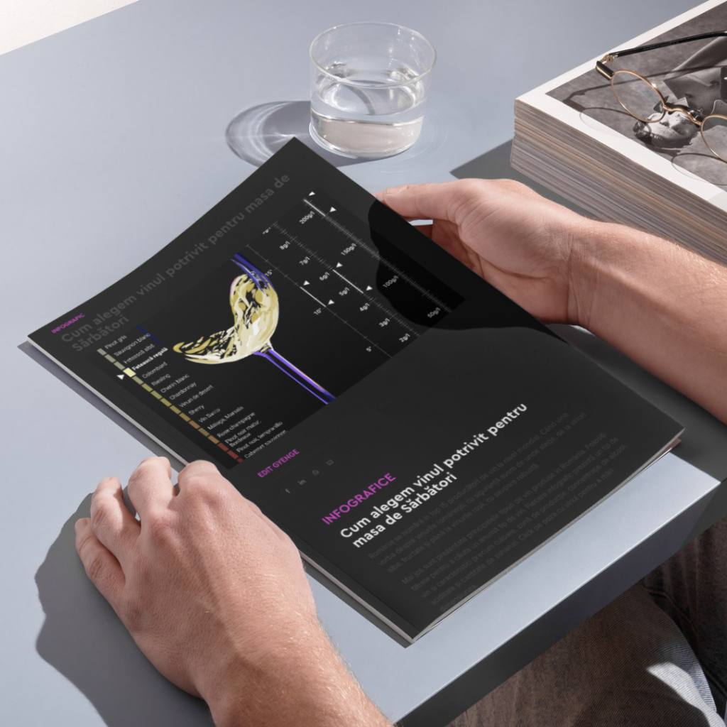
The final result is a clear, infogrThe finished product is a simple, infographic guide to Romanian wines. Although a more interactive version would have been nice, I chose to focus on what was most important for the project. Even though it is straightforward, it has worked very well. Romania is a leading wine producer, offering everything from crisp whites to rich reds. This visualization lets readers explore that variety, showing key details like color, region, alcohol content, acidity, and sugar levels.