Tools: Affinity Designer, Flourish Client:Panorama Data: National Statistics Institute, Romania, ata.gov.ro, The National Agency for Cadastre and Real Estate Advertising (ANCPI) Link: How the Housing Bubble Grew (RO)
Color palette:
Romania often appears at the bottom of European rankings for housing space per person. Instead of beginning with a set conclusion, I aimed to build a visualization that let users explore the data and find patterns and connections on their own.
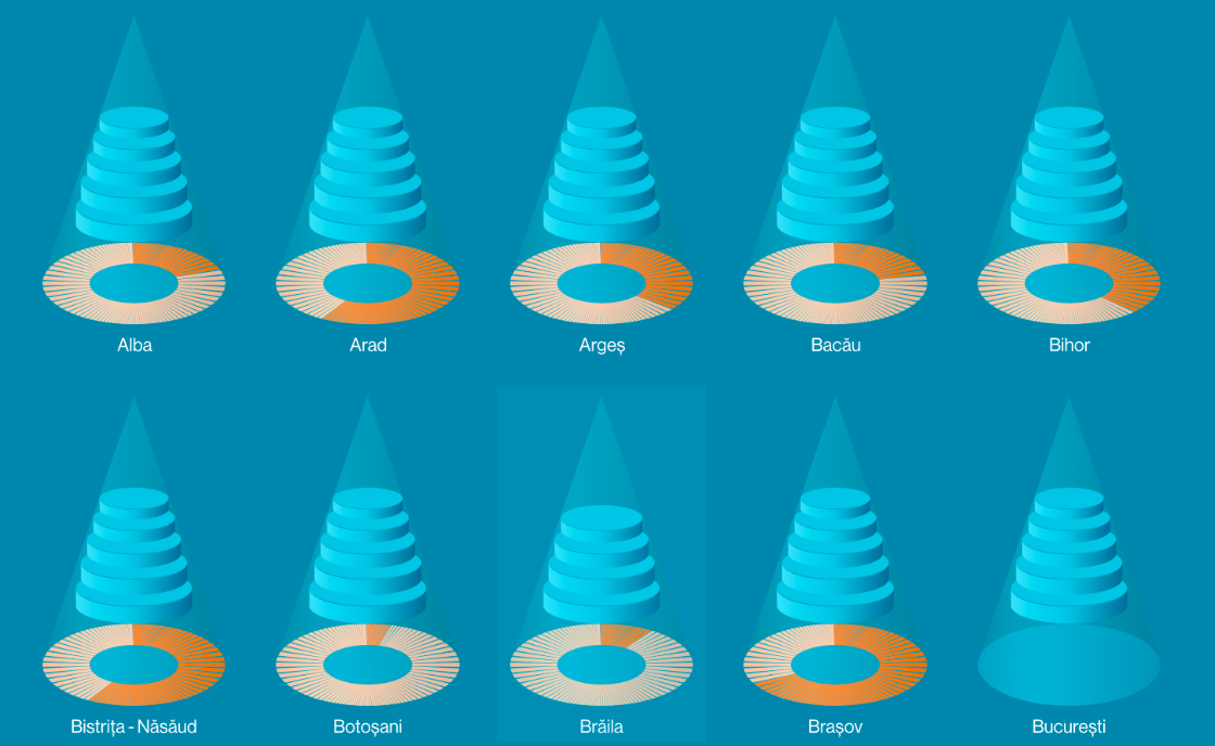
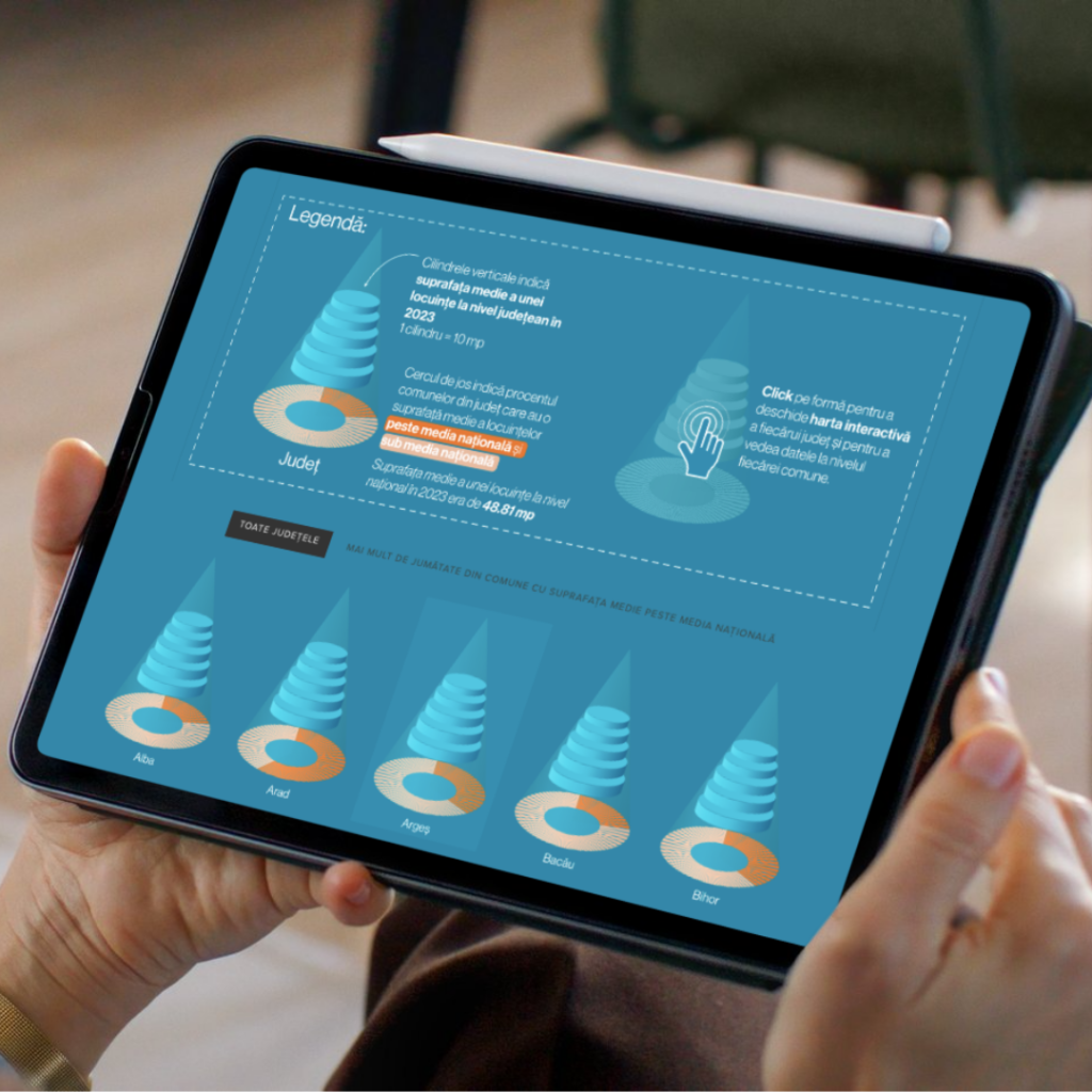
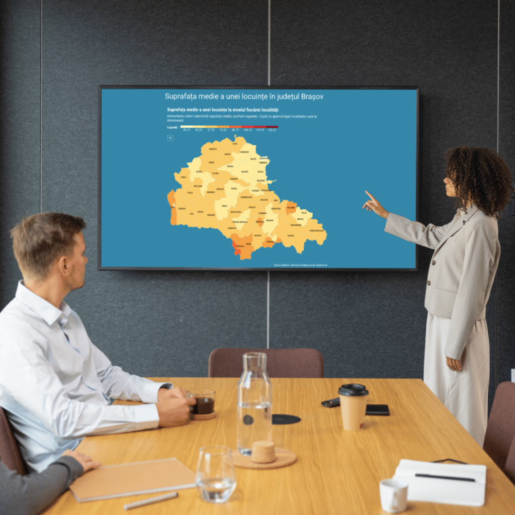
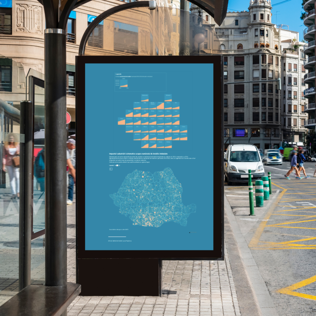
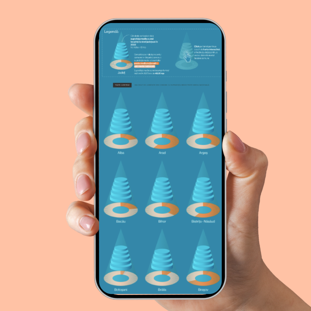
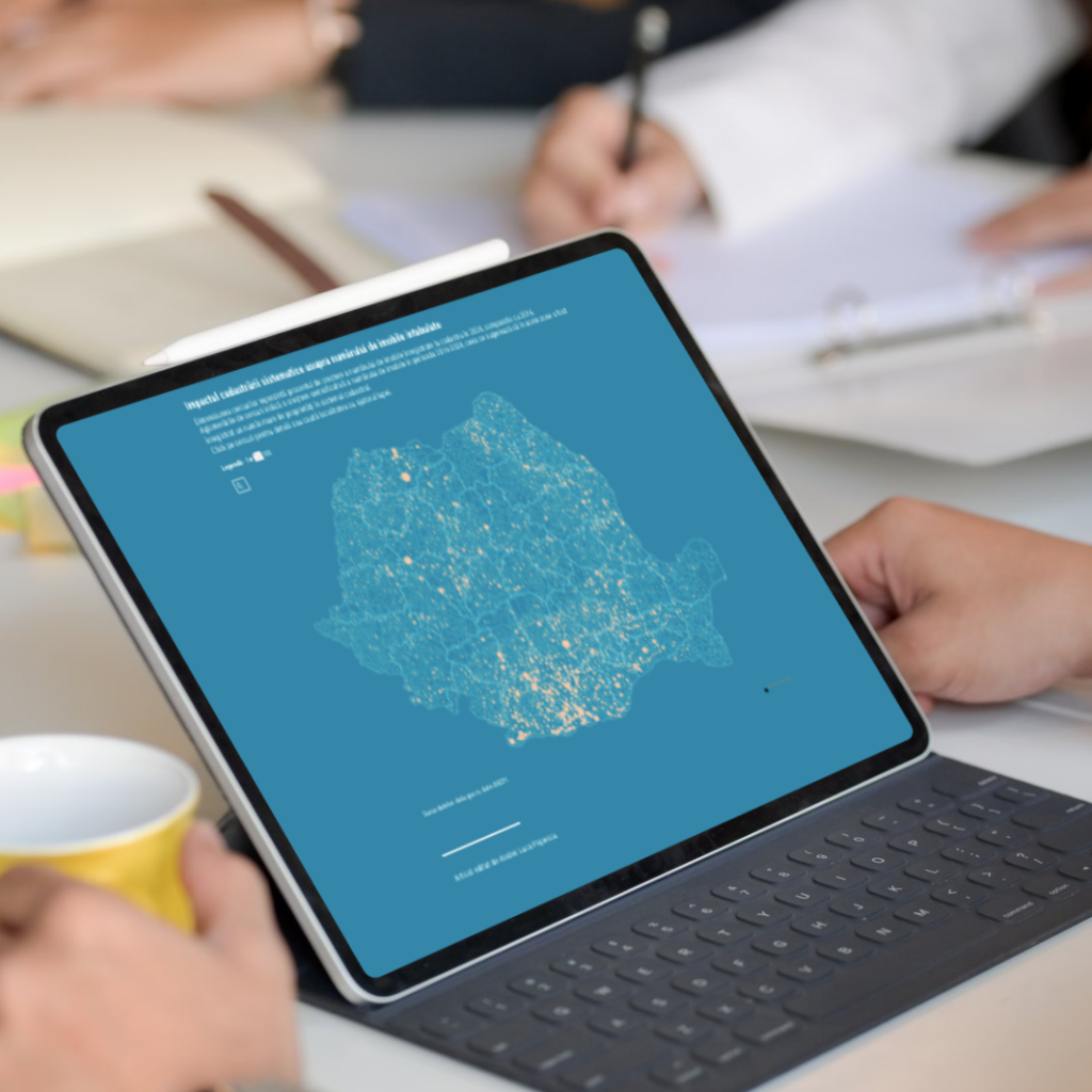
The finished project turned into an interactive story with layered visuals showing housing density per square kilometer, changes in home sizes, and how homes have changed over time permits. By adding cadastral registration data, users could follow property growth and spot differences between regions. Circles showed percentage growth, and clusters marked areas with big increases in property registrations.
This project also taught me something important about data visualization: sometimes the data does not reveal the big story you expect. It is the kind of topic you pitch with excitement in a newsroom, hoping to find something groundbreaking, but then realize the data is scattered, slow to change, and does not have one clear story.
This project highlighted the challenge of balancing visual appeal with practical work. The cone-shaped visuals had to be made by hand in Affinity Designer, which meant creating 42 separate files that had to be exported and uploaded as images rather than generated by code. This method was not efficient for the workflow. Worthwhile? Maybe.