________
Tools: Affinity Designer, Raw graphs, Tableau, Excel, animated video made with Claude code
Client: Infoclima.ro
Data: Administrația Națională de Meteorologie (ANM)
Link: Valurile de căldură: cum s-a încălzit România deceniu după deceniu?
Color palette: 

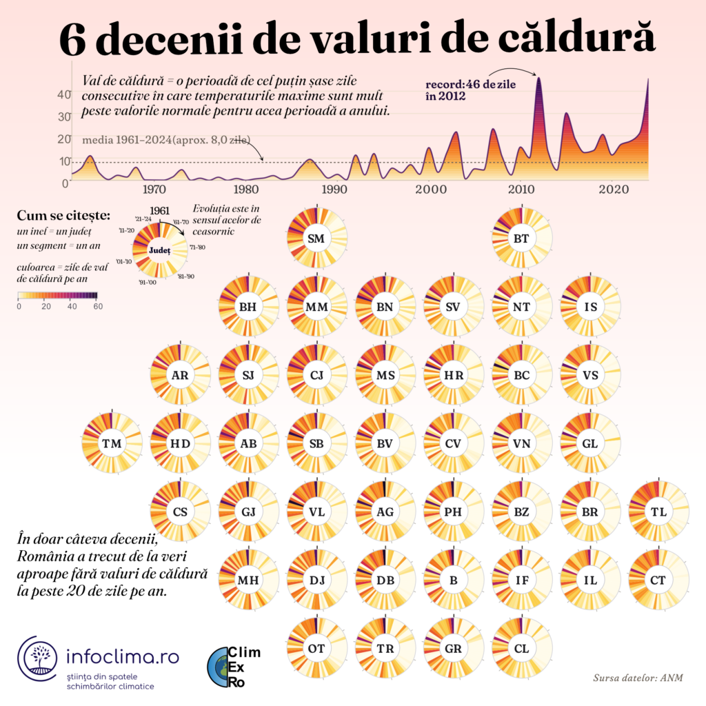
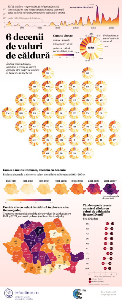
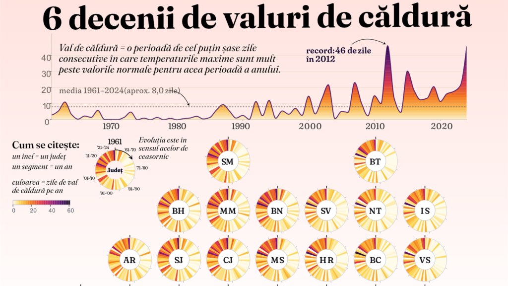
This project looks at more than six decades of heatwaves in Romania, county by county. A heatwave is defined here as at least six consecutive days when maximum temperatures are much higher than what is normal for that time of year. Between 1961 and 2024, Romania experienced an average of around eight heatwave days per year. In 2012, the most extreme year in the dataset, that number reached 46.
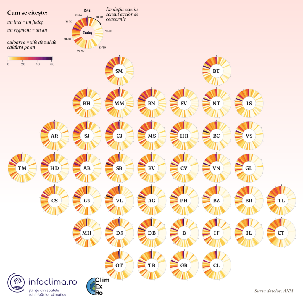
At the centre of the infographic is a series of radial charts, one for each county, positioned roughly according to Romania’s geography. Each segment represents one year, starting with 1961 and moving clockwise, while colour shows the number of heatwave days recorded that year.
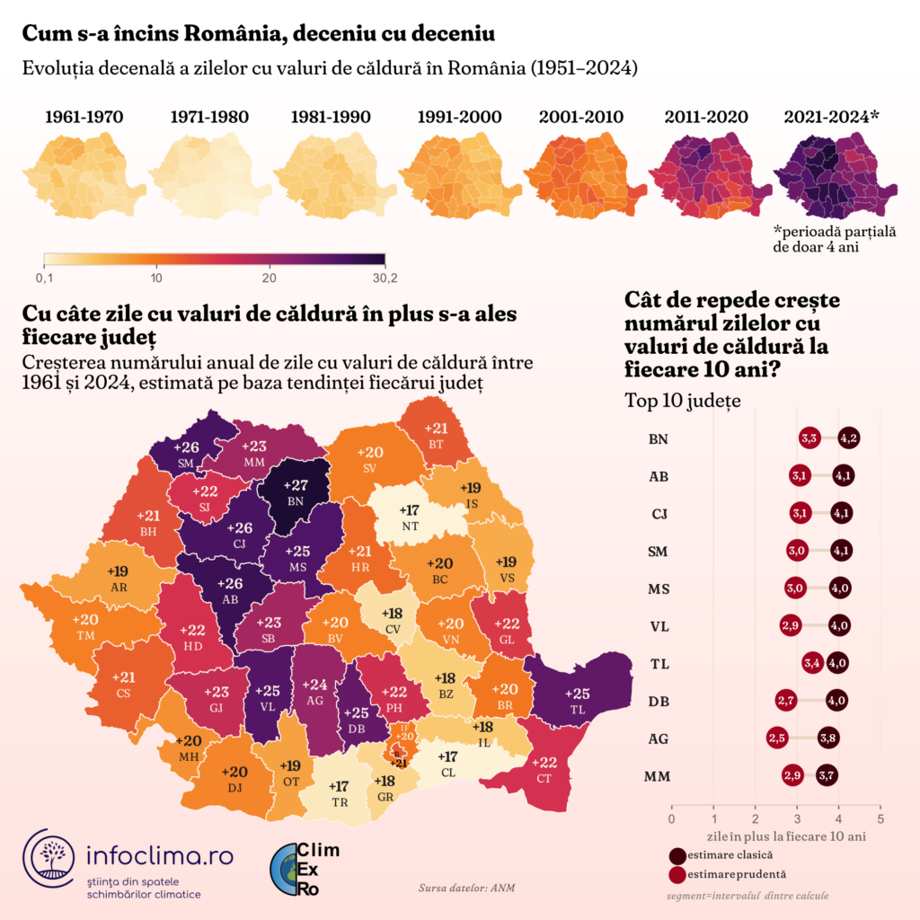
Looking at all the counties together makes the change over time immediately visible. The earlier decades are mostly pale, with relatively few heatwave days, while the last two decades become increasingly dense and dark. Underneath, a series of maps shows the same data by decade, followed by a final map showing how much the number of heatwave days has increased in each county since 1961.
I wanted the change to be something you could see building up over time, rather than reducing the story to a few numbers. Radial charts are not necessarily the best choice when you need to compare exact values, but that wasn’t the purpose here. I wanted to show more than sixty years of change across 42 places at the same time. Colour carries the values, while the circular structure makes the passage of time visible.