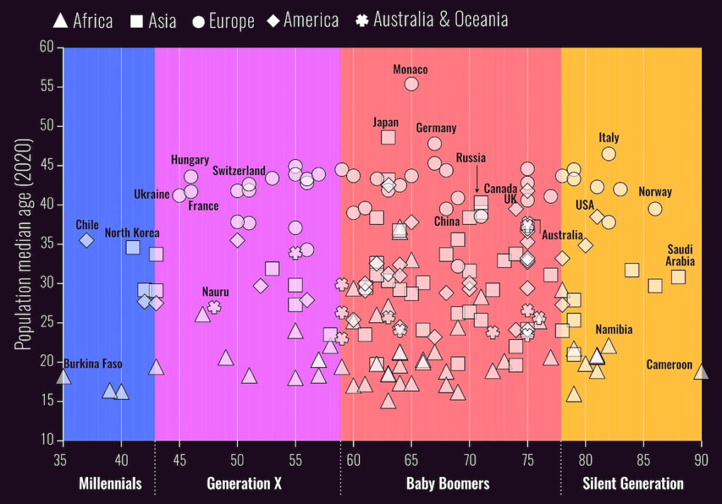
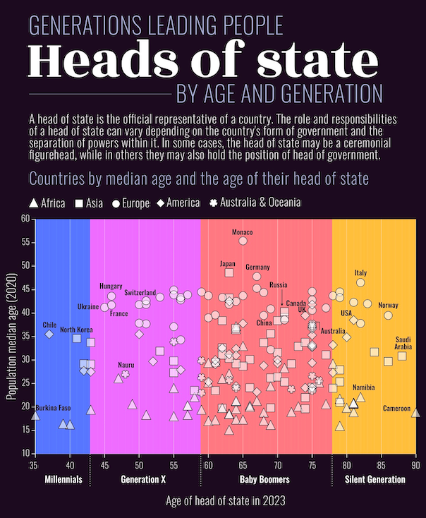
This static visualization, first made for Visual Capitalist, gives a clear and organized view of the ages of heads of state around the world. Unlike interactive projects, this one focuses on clarity instead of exploration. It is designed to be looked at, not navigated. In that way, it works well: it offers a quick snapshot of generational leadership in different countries.
This piece shows a simple, side-by-side comparison that makes its message clear right away: Who is in power, and how old are they?
However, age by itself can be misleading because choosing a younger leader does not always mean there is new hope for a generation. Sometimes, it happens because of family ties in politics, media influence, or voters wanting to punish someone. So, even though the chart points to a generational change, this piece shows why it is important to combine clear design with strong context. It is still one of my most organized and easy-to-understand visuals, but it also made me want to explore the topic more. It reminds me that even simple visuals can spark bigger conversations if we are open to looking deeper into the data.to question what’s behind the data.