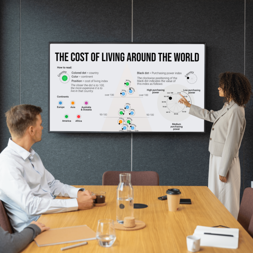
Tools: Affinity Designer, Flourish Client:Panorama Data: Cost of Living Index 2022, numbeo.com Link:The Cost of Living Around the World Color palette:
Freedom of exploration is sometimes so important even in static visuals. This visualization focused on understanding conditions rather than ranking countries. I decided to keep things simple, removing extra elements so the main idea would stand out.
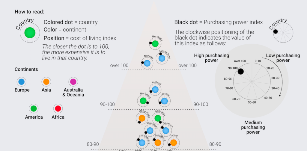
The idea behind this piece was straightforward but effective: show two indicators side by side in a way that encourages exploration without being confusing. Rather than using complex multi-axis charts, I went with a simple scatter plot. Each country is a dot, placed according to cost of living on the horizontal axis and purchasing power on the vertical axis.
I aimed for balance: enough detail to make people think, but clear enough for easy comparison. One important design choice was to color-code countries by continent, so users could quickly see both global patterns and regional groups.
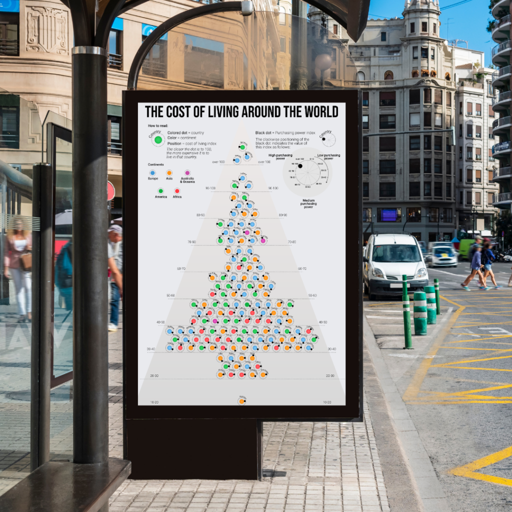
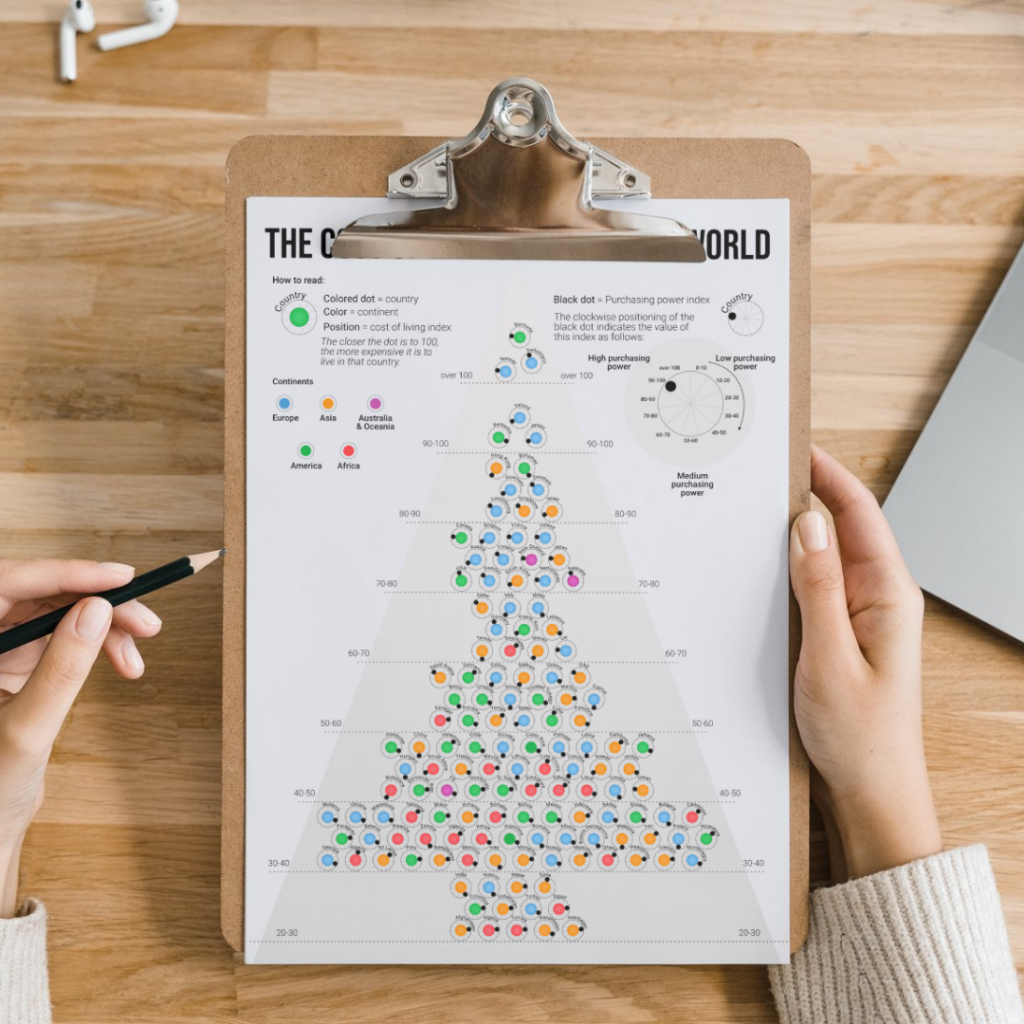
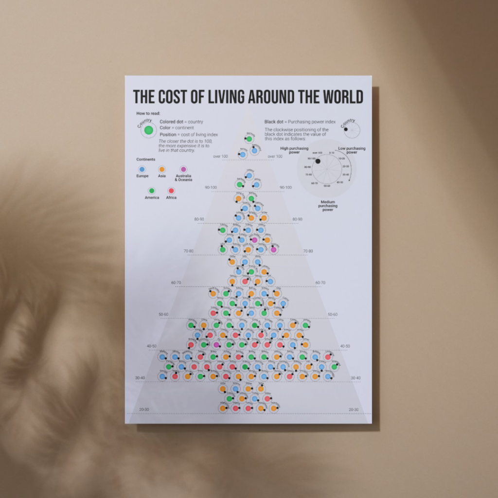
In the end, the visualization ended up looking like a Christmas tree. That wasn’t planned, but it did get people interested.