By Edit Gyenge
Nov 25, 2023
In our fast-moving digital world, flooded with data at every turn, the art of data visualization has become increasingly crucial. But here’s something to think about: before you jump into the sea of available tools for your next data visualization project, ask yourself, “How will this project really make a difference for my readers?”
Effective data visualization equips your audience with (at least) five superpowers:
So, the real question before picking your tools isn’t just about functionality, it’s about the impact. Which of these ‘powers’ are you aiming to offer through your project? While it’s great if you can blend all these in one piece, sometimes just focusing on one can create a huge impact. I like to think that there’s no such thing as a ‘good’ or ‘bad’ data visualization. It’s all about whether your visualization hits the mark – does it empower your readers as intended? Based on what I’ve learned from my own work, I want to share the five main things I really pay attention to in my data visualization projects. I’ll give you some examples and talk about why each one is important.
In the complex world of data, the little bits – the micro-level data – are really where the action is. It’s like going beyond those general stats about countries or regions and finding hidden gems in the details. Think of it as looking at a big, amazing mural but also noticing the beautiful little brushstrokes that make it up. To really understand what’s going on and make smart choices, diving into the small details is key.
Here’s another way to picture it: looking at Earth from space – you see land and water. But when you zoom in, you start seeing all sorts of exciting things – cities, forests, even people going about their lives. So, do we need to focus on these small details in data? Absolutely! It’s like going on an adventure to see the whole story. Of course, it varies with each project and what you’re aiming for. Let me give you a personal example.
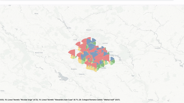
Just like zooming in on Earth from space, I applied the same idea to mapping exam results in Romania. Every year, high school students here take a big test called “Bacalaureat.” When representing these results, even though looking at the details of these exam results could tell us so much, media outlets and public institutions focus on the big overall picture, county-level data, or even national averages. There’s a lot more to it than that.
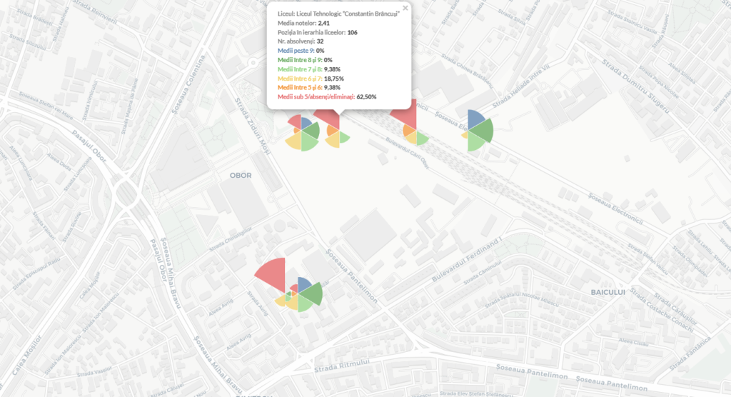
Each student and each school are unique. That’s why with this project I wanted to show how important each student is and highlight the big differences between schools, even in the same city. This interactive map represents each school in Bucharest city. You can zoom in on the map to find the school you’re curious about, or use the search button. Each school is represented by a coxcomb chart. The different colors on the chart show different score ranges, like scores between 9-10, 8-9, and so on. The size of each slice of the chart shows how many students in that specific school scored in that range. So, you can see at a glance how the students at each school are doing.
Why does this matter? First off, it helps us steer clear of making broad generalizations. When we’re talking about making education policies and strategies, having a clear, detailed picture is key for custom solutions, tailored to children’s needs. It also makes it easier and clearer to compare different schools, which brings transparency into discussion. Also, it shows us how things are spread out geographically, and we might even spot some connections with certain neighborhoods that aren’t all on the same level economically. These are just a few reasons why having this kind of detailed data representation is helpful and important.
Charts can range from super simple to really complex, and they’re made to suit different needs and tastes. How complicated a chart should be often depends on how much your audience knows about the topic. Data pros might love detailed charts, but people new to the subject might prefer something easier to understand. Finding the right mix of detail and simplicity is crucial so your charts hit home with the people you’re talking to.
A strong aspect of data visualization is giving your readers the power to explore. It’s similar to giving them a map to find their own way through the data. Think of it like an explorer with a map, venturing into new places. I believe a good data chart organizes information in a way that lets your readers dig in and discover things on their own.
You want to give your readers the tools to play around with the data, look at it from different angles, and come up with their own ideas. But even though we want to encourage exploration, we don’t just leave readers to figure everything out by themselves. Guided exploration means adding helpful things like interactive bits, notes, and background information. These help point readers towards interesting findings without boxing them into one way of seeing things. The idea is to help readers discover on their own, without pushing them down a single path.
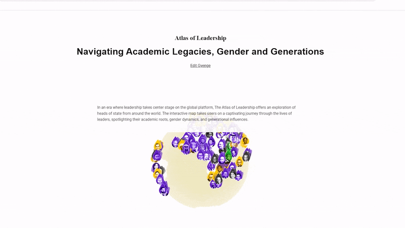
I think this project really encourages exploration, and here’s why: First off, it’s a tool where I mixed together different types of data – like the age, education, and gender of heads of state. This creates a big, broad context, setting the stage for the readers to dive in and explore. Secondly, even though some parts are clear and explained in short paragraphs, there’s still an interactive part. This lets the readers get into more specific elements, like data about different regions and countries.
The tooltip is a key feature here. It doesn’t just show the data we’re looking at, it gives extra information, like what university these heads of state graduated from. This might not be your usual kind of exploratory data visualization, but it’s a piece that takes the readers on a journey through the stories of heads of state, comparing information about their education, analyzing how gender and age play a role, and more.
Picture this: you’re looking at some complex graphs and charts, each packed with important information. Now, think about those same visualizations, but organized in a way that makes comparing data easy. The difference is huge. When data is laid out for easy comparison, it’s simple to spot trends, outliers, and how different things relate to each other. It’s all about making things simpler so you can get more out of the data.
When you’re making these visualizations, it’s key to create a clear layout. Put the most important elements, like trends or comparisons, front and center. You can do this by playing with colors, sizes, and placements. This way, you are guiding the viewer’s eye, making it easy for them to see what’s similar and what’s different.
It might be tempting to throw in fancy design elements, but when it comes to comparing data, keeping it simple is usually better. Go for clean lines, a simple color scheme, and a layout that’s not too busy. This helps keep the focus on the data itself, without distracting bells and whistles that can make it harder to compare and understand the message.
Let’s dive a bit deeper into this whole comparison idea. We all tend to make comparisons to our past experiences, right? This specific project actually came from that classic line I kept hearing: “When I was young, we didn’t do this or that.” I wanted to use data to make those kinds of comparisons possible without the interference of personal perceptions. We often judge the past or compare it to the present based on our feelings and perceptions, not hard data. This project shines a spotlight on the data.
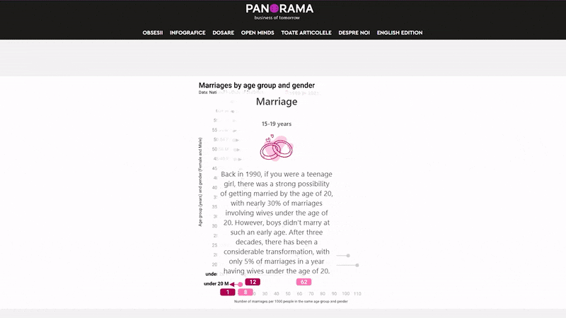
Imagine a story that takes you through the drastically different lives of Romanians right after communism fell in 1989 and their lives today. Romania’s changed a ton in the last 30 years, in every way you can think of – economy, politics, technology, lifestyle, and even how people handle money and socialize. The country today is almost nothing like it was back then, both in good and bad ways.
In this interactive story, the readers can pick an age group and see what life looked like for that age group back in 1990. The charts cover eight key indicators across ten age groups, for both men and women. We’re not just looking at the whole country’s population; we’re getting into the details of each age group. This lets us see the real changes, like out of a thousand people your age and gender, how many got married, divorced, had kids, lost jobs, and more back then versus now.
Context is extreemly important in data visualization, no matter what kind of data you’re working with. Sometimes, to really make things clear for your readers, you need to bring in some extra data. A chart can show a lot, but people often need a little help to get the full picture. So, if you need to explain things more, go for it. This way, your audience gets a deeper understanding of what you’re showing them.
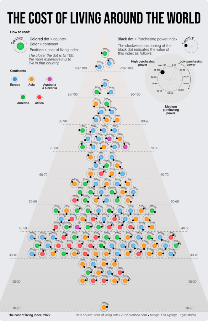
This topic is one of my favorites when it comes to data visualization. The data is always relevant, year after year. This index usually doesn’t suffer major changes from year to year. Northern European countries are often at the top, while African and South Asian nations are usually at the bottom. But there’s more to it than just comparing numbers. The challenge is to find new, creative ways to represent it.
This chart is a mix between a beeswarm chart and a scatter plot. Or, you could think of it like a Christmas tree, especially because of how the data points are arranged – there’s a bunch at the bottom and they thin out as you go up.
But when we start talking about context, it’s clear that just chatting about the index (where a higher number means living costs more) isn’t enough. To really help people understand and give them a fuller picture, I added another measure to the mix: the purchasing power index.
Here’s what comparing a country’s cost of living with its purchasing power can tell us:
Usually, if living costs are high, so is purchasing power, but there are some interesting exceptions.
Data visualization is a lot more than just charts and graphs. It’s like telling a story that really grabs your audience’s attention. Even with complex topics, making it relatable is key to linking the data to real life.
Making your data visualization relatable means creating a connection between your audience and the information. Here, empathy is important. If you get where your audience is coming from, what they care about, and what grabs their interest, you can design your visuals to really hit home. When people feel like you get them, they’re more likely to care about what you’re showing them.
At its core, relatable data visualization is all about storytelling. Every set of data has a story behind it, and your job is to bring that story to life. When you set up your visualization like a story, you take your audience on a journey of discovery. Just like how characters and plot twists keep us hooked in a book, the way you use colors, arrange elements, and show data changes can make your visual story engaging.
Relatability can show up in different ways. It might mean linking the data to something your audience already knows or feels strongly about.
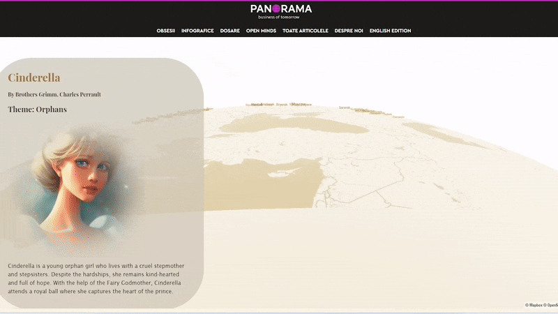
Speaking of books and stories, here’s a project that got its spark from them. This interactive story is all about showing the big differences in the lives of children in Eastern and Western Europe. Not every child gets to start life with the same opportunities, even in places like the European Union. This brings up a big question: How much does where a child is born in the EU affect what they might face in life, and which countries are the toughest to grow up in?
Where a child is born can really shape their whole life. For some, it’s like being the Little Match Girl, trying to get by without enough to live on. Others might face a life of poverty, like Oliver Twist, or grow up in tough situations like Cinderella, without their parents and hoping for something better. Then, there are kids like Heidi, who grew up with loving grandparents.
This is all about an immersive story where I’ve used the traits of book characters, along with data from Eurostat and the World Bank, to create a metaphor. It’s about figuring out which book characters the children from different European countries might represent.